Three Fields Entertainment
Branding a genre defining video games developer & publisher
Brand Identity
Brand Guidelines
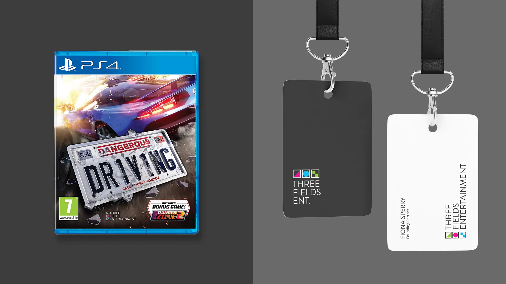
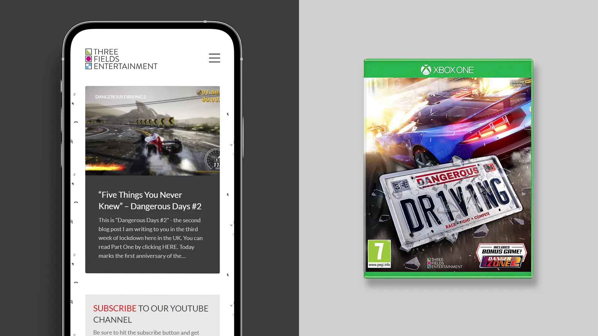
Packaging Design
Art Direction
Illustration
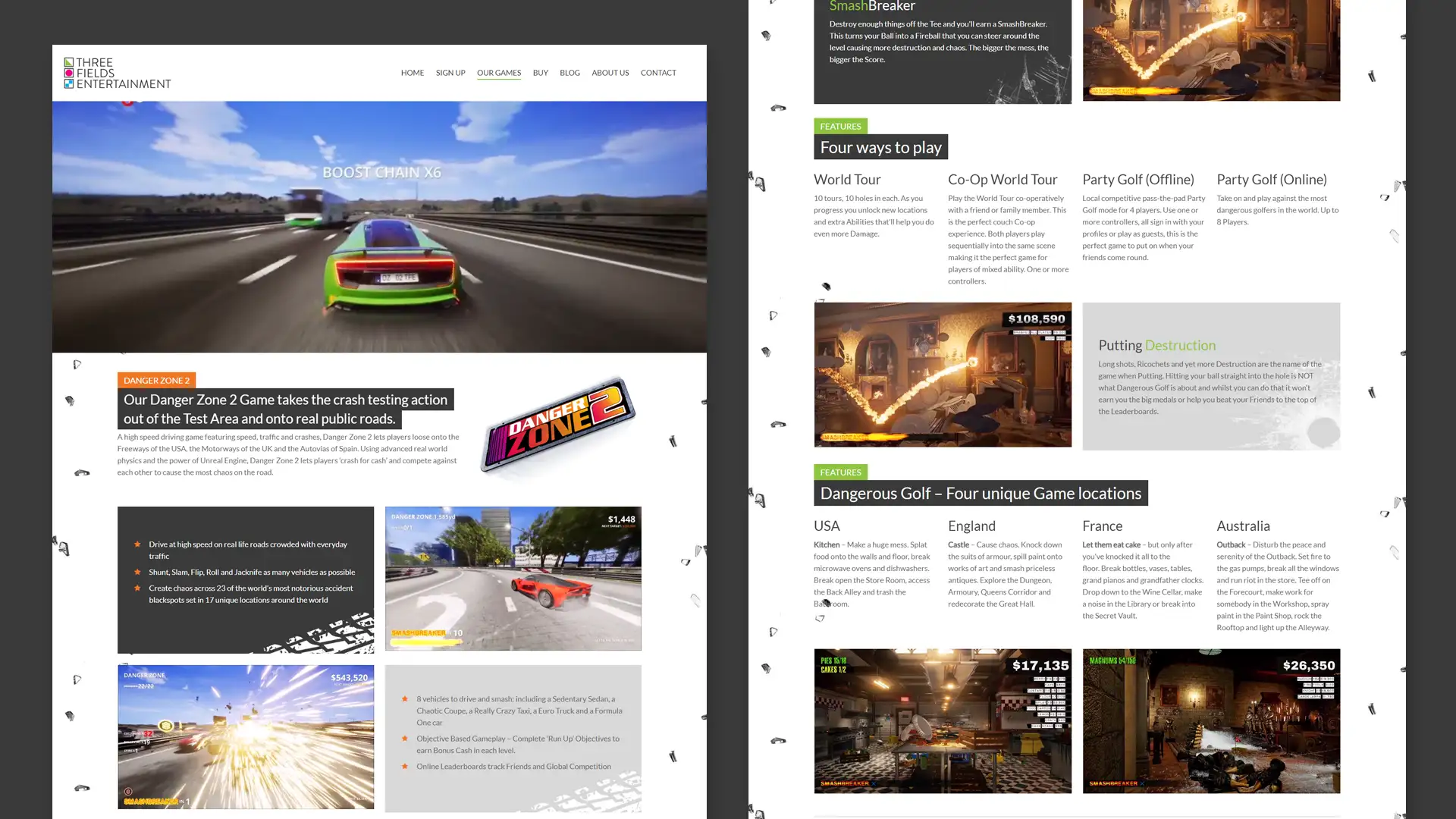
Website Design
Read more…
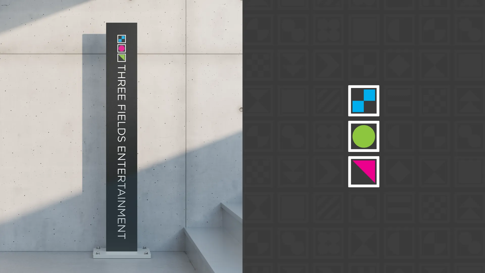
The logo development gravitated to the story behind the company name. The idea that bringing together three different areas of expertise, rather than specialising in a single area, leads to a more dynamic and stronger outcome.
A set of icons in a grid of three forms the basis of the core branding. With the combination of the three icons changing on a flexible basis to represent three different fields. Each icon is geometric, minimal and anonymous to represent the ethos of the name without giving away the secret formula.
The range of icon shapes and colour palette reference the language used by the video game industry Big 3 (Nintendo, Microsoft and Sony). A thin modern sans-serif communicates the technical nature of proprietary technology that Three Fields pioneers.